I was a digital design intern in the Design Co-Op program during the Fall 2022 session in the Oral Care department at Procter & Gamble. During my time there I was given the opportunity to create impactful digital solutions for the oral care department across a variety of platforms.
Me: Digital Design Intern
Peter Middleton: Intern Manager/Design Advisor
Dana Moon: P&G Dental Hygienist
September 2022 - December 2022
During my time as a digital design intern, I redesigned a denture cream website to be more of an information hub for denture discovery, encouraged connection in oral care through designing a sharing option feature for the Oral-B iO app, and created a method of documentation for dentists to enhance post-appointment patient care within the Oral-B iO app as well.
01.
Uncovered easy to implement but impactful ways for the Oral-B IO app to improve oral healthcare in the lives of people.
02.
Enabled higher user engagement and connection through sharing of brushing data through Oral-B IO app.
03.
Improved user recall of dentist advice by providing visual references.
The Oral-B IO app, which is a companion app for the Oral-B IO toothbrush series, is one of the primary products of the oral healthcare department at P&G. The team is looking for new ways to provide value with the toothbrush and app as the product continues to grow.
How might I promote better oral care through community engagement in the Oral-B iO app?
Studies show that 90% of Americans do not brush their teeth correctly, which is an issue the Oral-B IO toothbrush and app strive to solve. The team wanted to use their app to continue to engage their user base, who are primarily adults. When speaking with current users, many of them mentioned that they knew others, such as their friends, partners, or family who also used the toothbrush. I realized that there was an opportunity to use the app to further connect users to one another and continue to help them encourage each other to take even better care of their oral health.
Building better habits is improved through the use of social accountability, which was something I kept in mind while thinking of ways to further connect people through the Oral-B IO app.
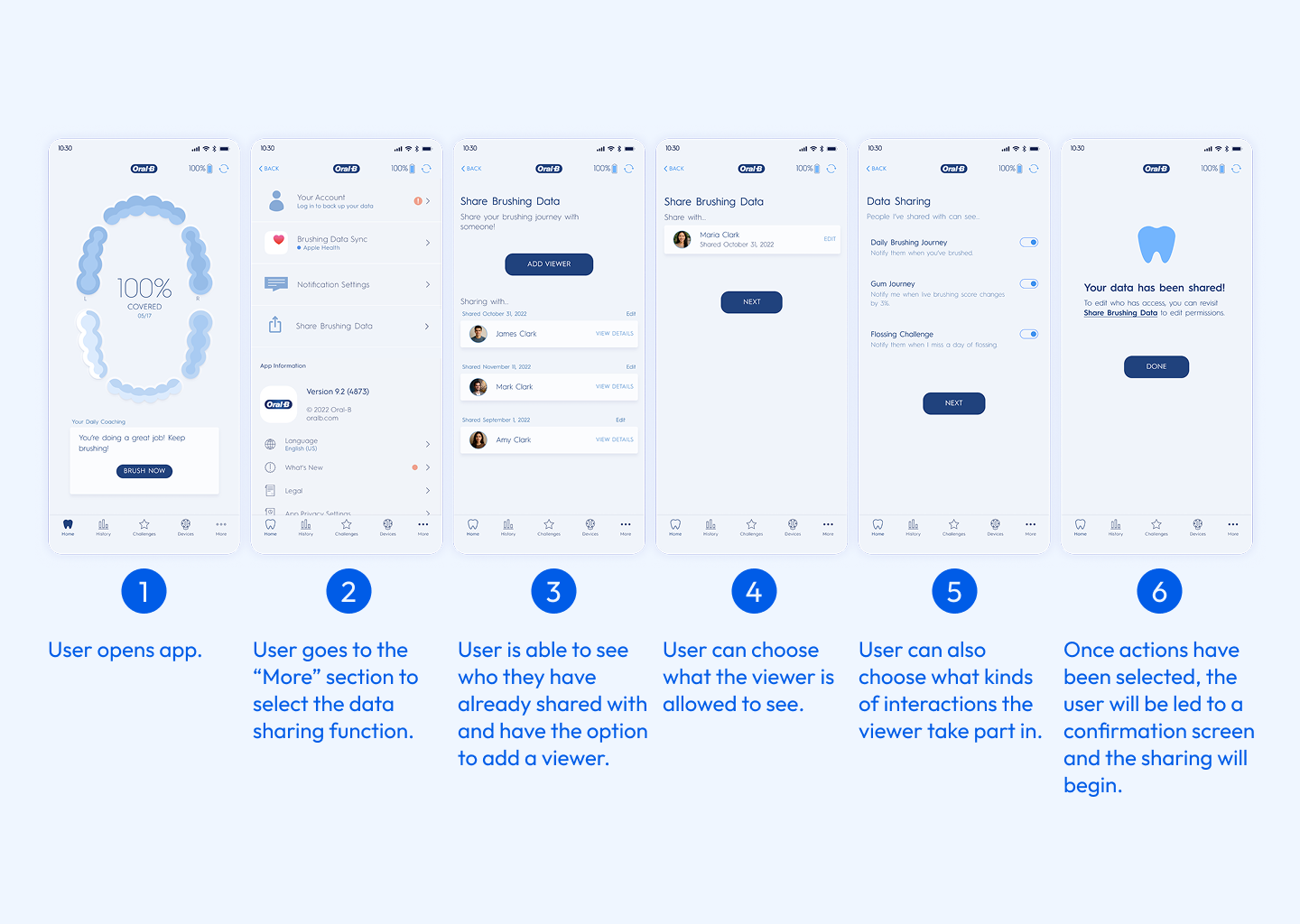
To illustrate how an adult might find the Oral-B IO toothbrush and sharing its data via app helpful, I created a storyboard to share with stakeholders.

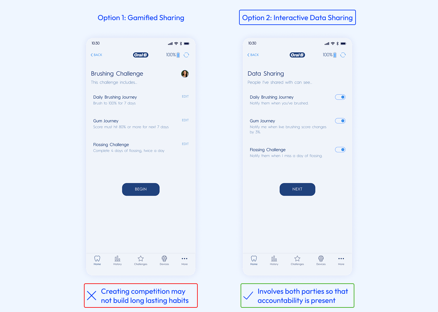
The final design is a data sharing feature that allows users to invite others to view their brushing data with them, send reminders, and track their progress.
To see if the initial designs for sharing brushing data were meeting their end goals, I tested the screens with 6 current users of the Oral-B IO toothbrush and app and collected feedback that could direct me towards future improvement.
4 out of 6 users confirmed that they would like to use sharing features with elder family members or even their kids to help track and encourage better brushing.
Users liked being able to send reminders to others but also mentioned they felt like more intentional selection options, could be even more helpful.
How might we assist patients in being better about taking dentist-recommended actions post appointment?
According to other research studies, patients tend to forget 40%-80% of the information that is given during medical consultations, leading to low improvement rates. The dental hygienists that work with the oral department confirmed this issue, mentioning that they having trouble seeing patient improvement between appointments.

We spoke to 6 users to further understand why recalling things from a visit to a healthcare provider can be difficult.
Unclear instructions are given, leading to patients being unsure about specific actions to take after.
There is too much happening between conversations and actual dental work to remember details.
Reliance on remembering spoken instructions is hard, smaller details are easily forgotten.
From our interview findings, I determined that providing a visual way for dentists to document their instructions could be beneficial in helping patients remember and act upon their instructions in the future. I explored 3 different interface options with my manger, and we decided to further develop the option that most closely aligned with our goals.
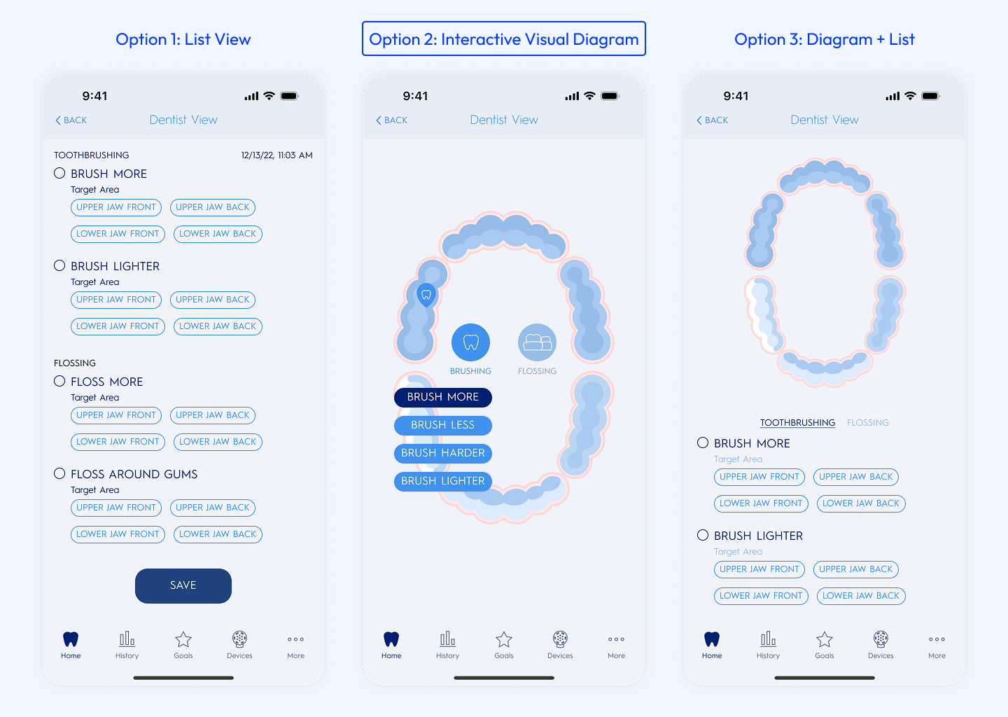
We decided to explore the design of a visual diagram as a note-taking tool because it would be easy for dentists to use during the appointment and also be something easy for the user to understand afterward.

I tested my earlier low-fidelity prototypes with the oral care department’s dental hygienists to understand how my designs could be improved and received the following feedback.
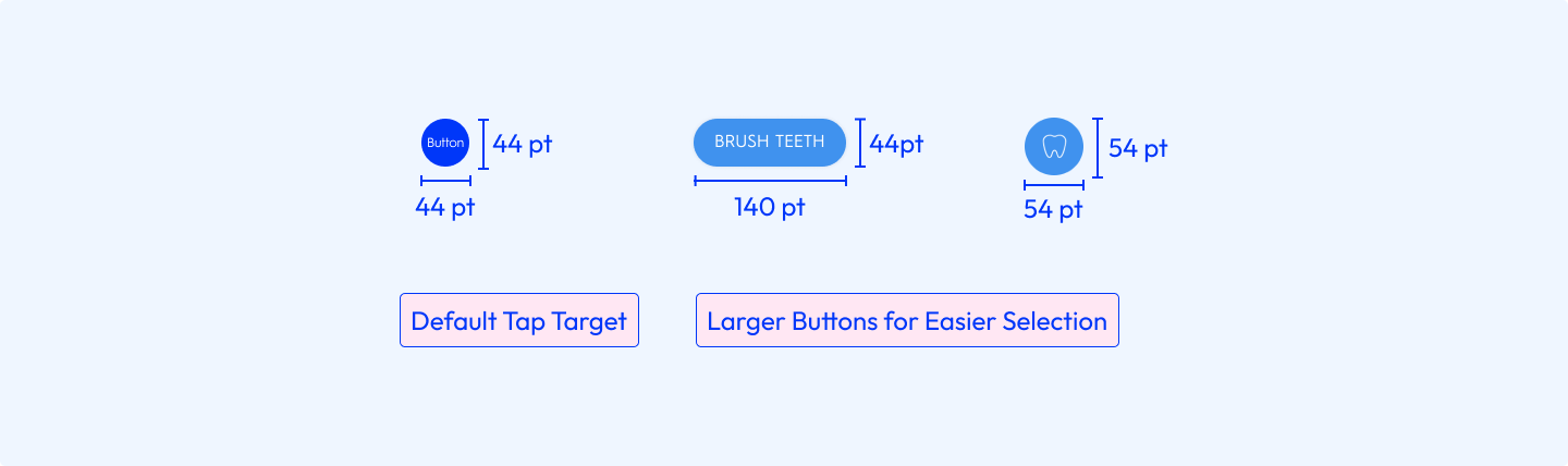
Dentist hygienists might be wearing other protective equipment that affects touchscreens.
All possible options should be shown as available for selection.
Any addition to a dentist’s routine must interrupt their workflow as little as possible since time is limited.
This interface was designed to be used by a dentist during a dental appointment which meant that I needed to take the environment into consideration. Since dentists usually wear latex gloves which can lower tap precision on a screen, I made the option buttons larger.
The final design allows dentists to easily note areas of improvement in a patient's mouth during the appointment, and the patient can easily refer back to the notes left by the dentist post appointment to make sure their oral care routine targets those issues.


During my intern projects, I came to understand that designing goes beyond what is on a user's screen, and we should instead captures the whole experience from end-to-end. Considering the touch points that lead a user to a digital product will lead to a better overall understanding and solution of the pain points you're solving for.
This was the first time where I designed features to fit into a digital product with an established design language! I learned how important it was to understand the existing design language so that the resulting design is one that a user can trust and easily understand how to use.