
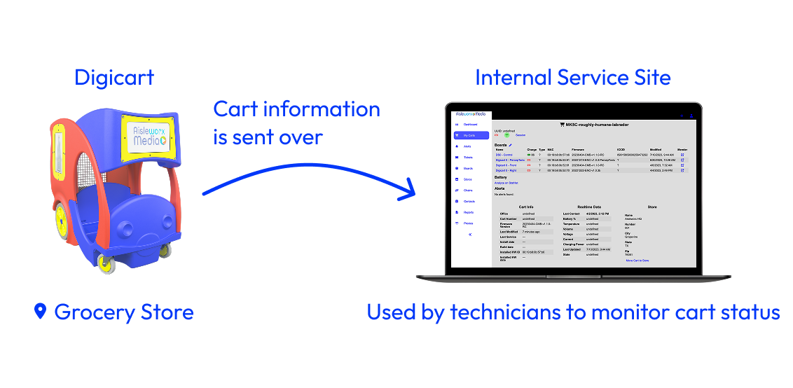
Aisleworx Media maintains their core product, the Digicart, a grocery cart with digital screens, through an internal management platform that allows them to perform various tasks relating to the product. This platform sees a need to continue to evolve as new features are being added.
1 UX Designer
1 Product Manager
3 Software Developers
October 2023 - June 2024
As the sole designer, I was responsible for the redesign of the desktop screens and design of the mobile screens for the duration of the whole design cycle until handoff to the developer team. I conducted research, iterated and tested designs, and finalized screens for coding. During this process, I collaborated with our product manager and the developer team.
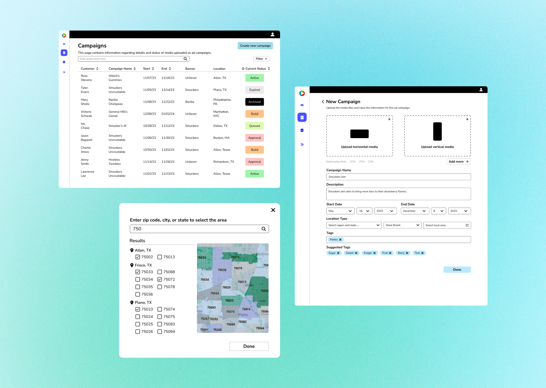
Aisleworx Media’s main physical products were Digicarts, family-friendly grocery carts with electronic screens that played media on the side. These Digicarts were managed through an internal service site that contained detailed live information about the carts, and the site was monitored on a daily basis. However, the current site lacked key features and needed an improved layout.
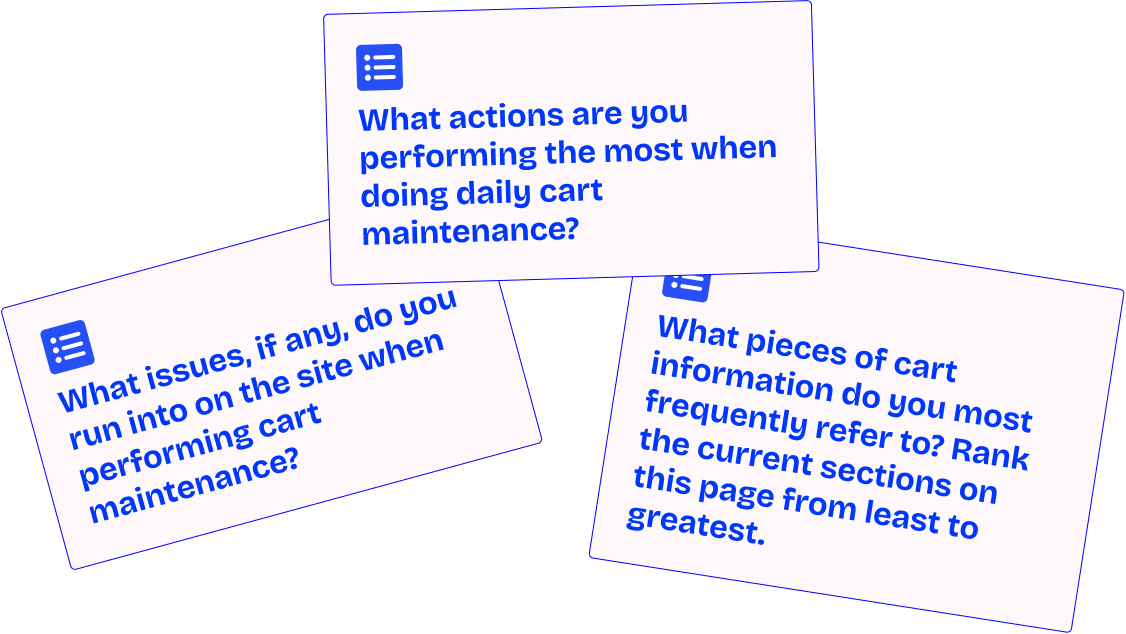
I spoke with the team of 7 internal company technicians to understand how the site was used on an everyday basis and how that could guide the redesign to serve the most important issues first.

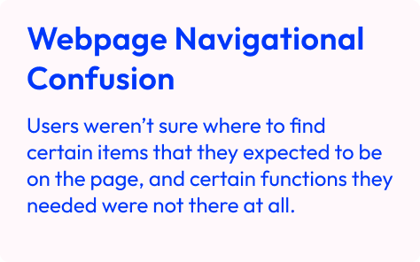
When developers initially built this site, they simply added the necessary features to the right pages. This led to the design of the site being pretty inconsistent and offered opportunities for improvement.

The scope for this release was narrowed down to the maintenance flow, the primary function that the website supports.
1. Pull information from cart detail pages for diagnosing and maintenance.
2. Daily cart maintenance.
3. Track cart ownership and location of carts in stores.
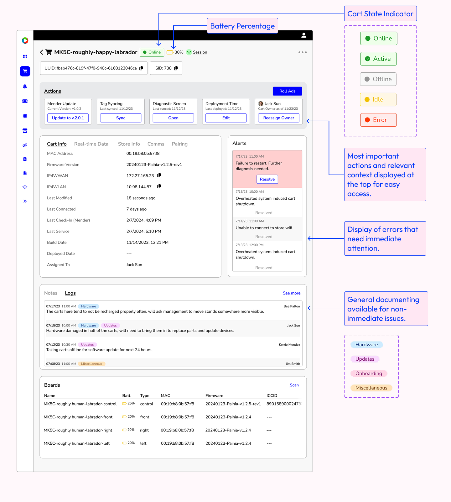
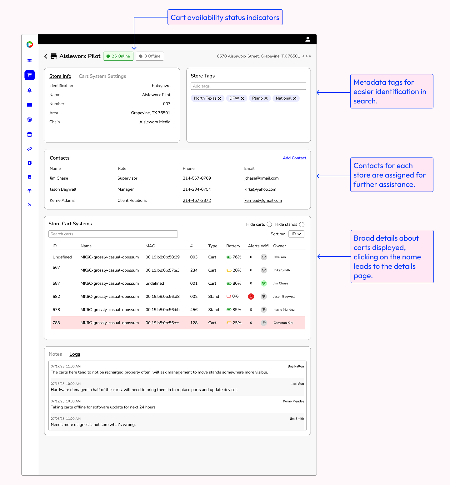
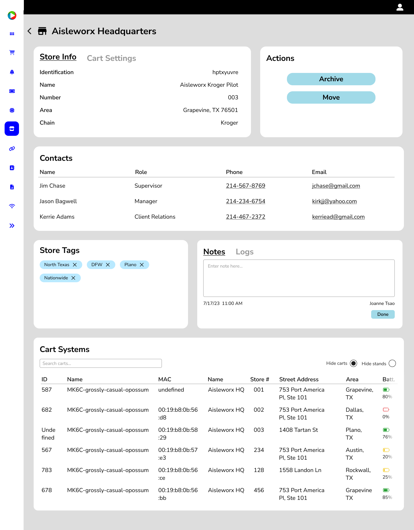
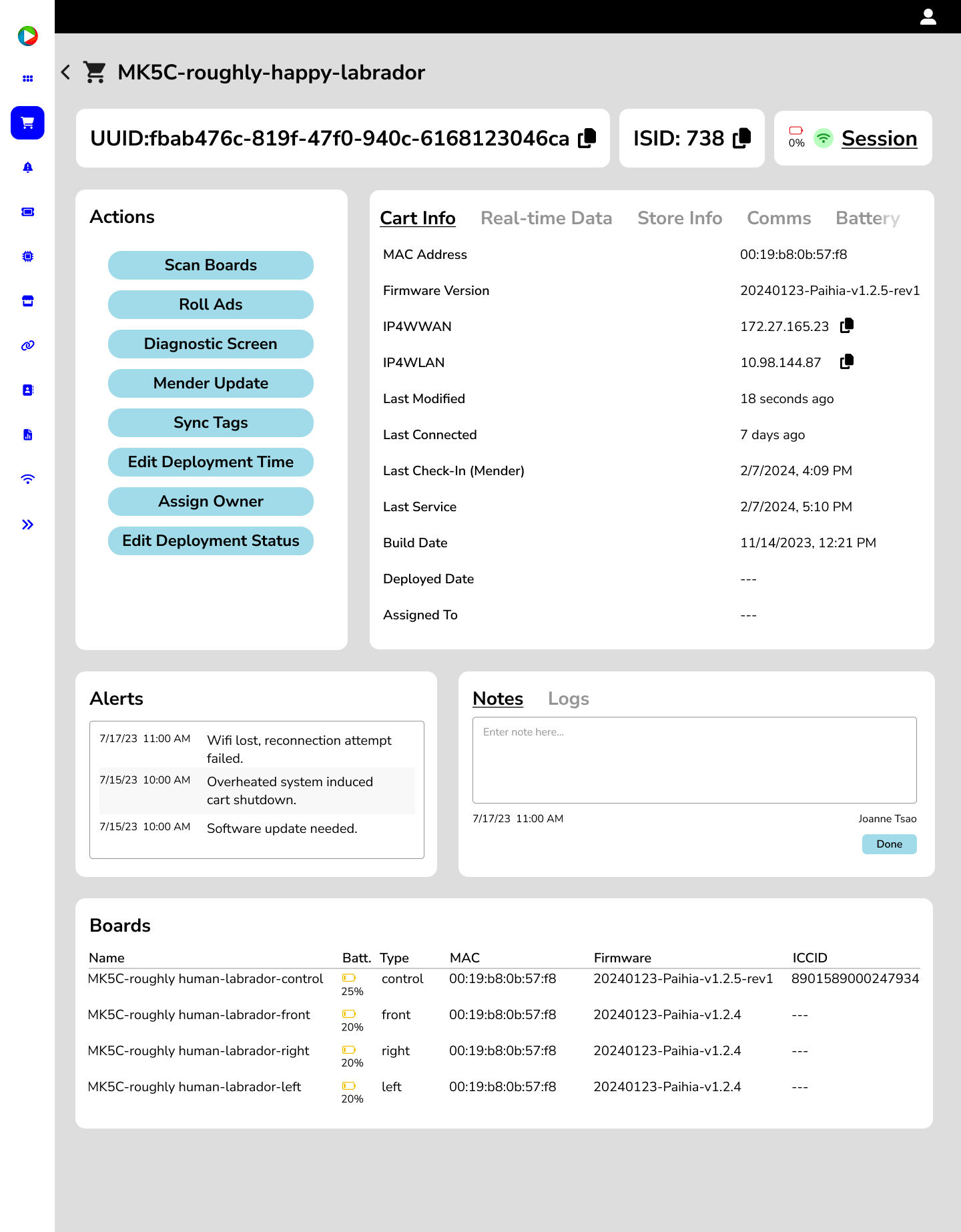
A page with all the information about the hardware and software of a specific cart. Most important functions are prioritized for easier access and the layout is optimized to be easily scanned during daily maintenance.
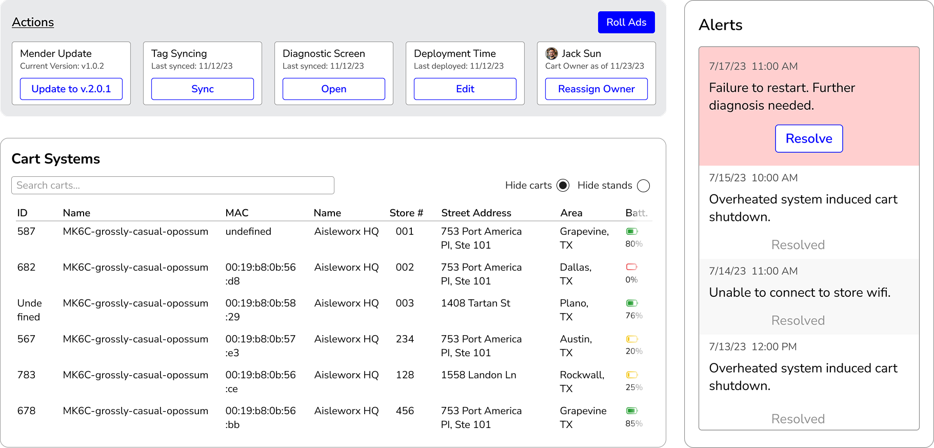
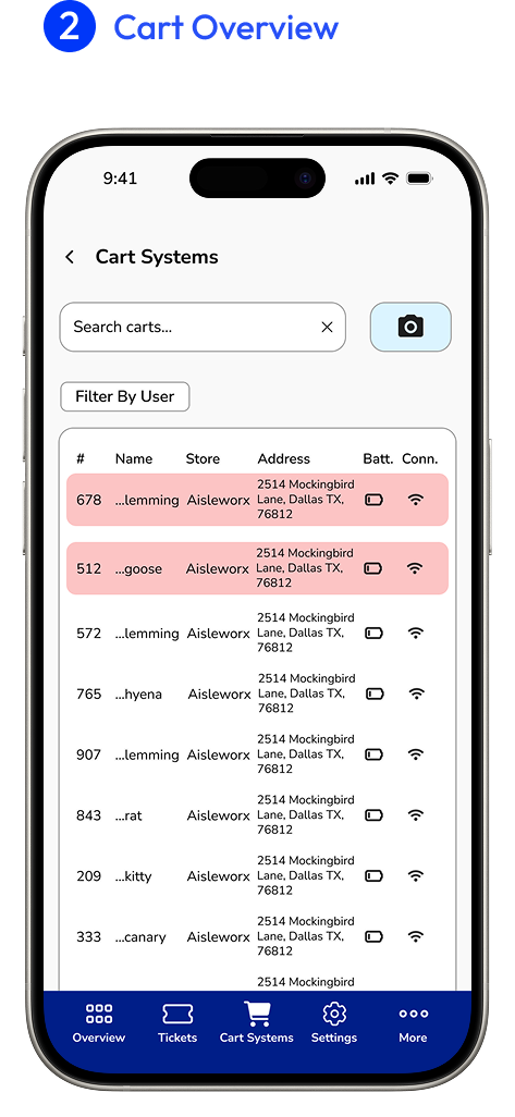
A broader overview of how cart systems are operating within a store through relevant live data and other details pertaining to the overall maintenance of the cart systems.
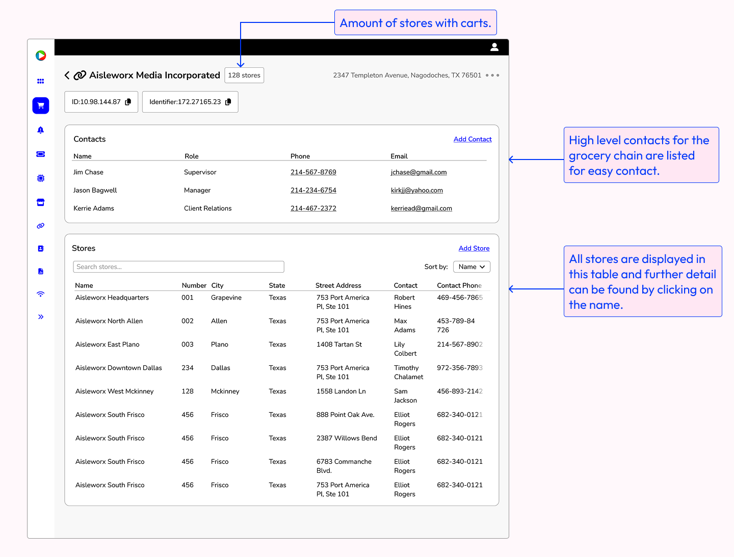
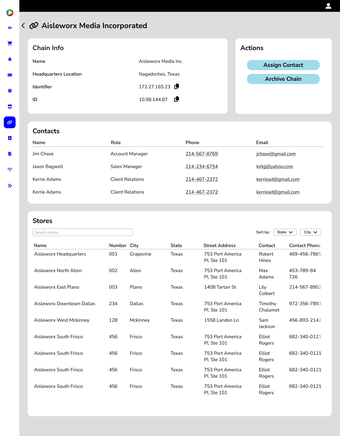
High level overview of a specific grocery chain, displays overview data of stores that have carts.
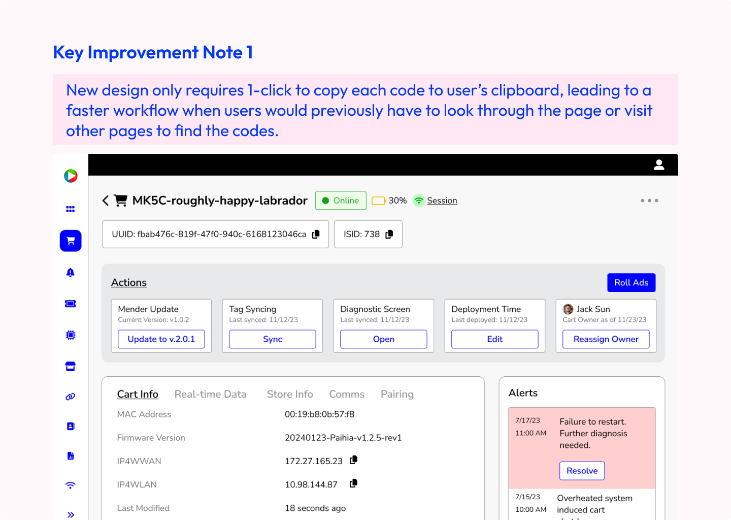
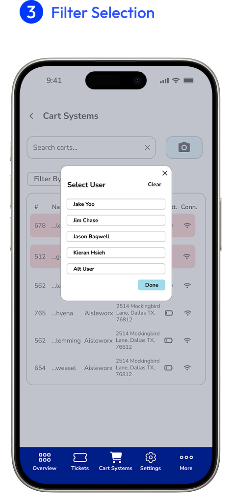
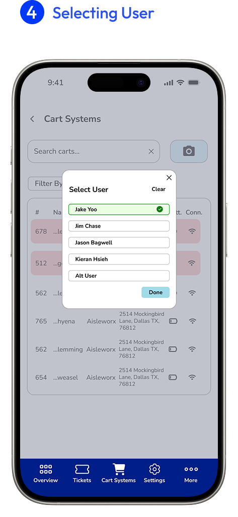
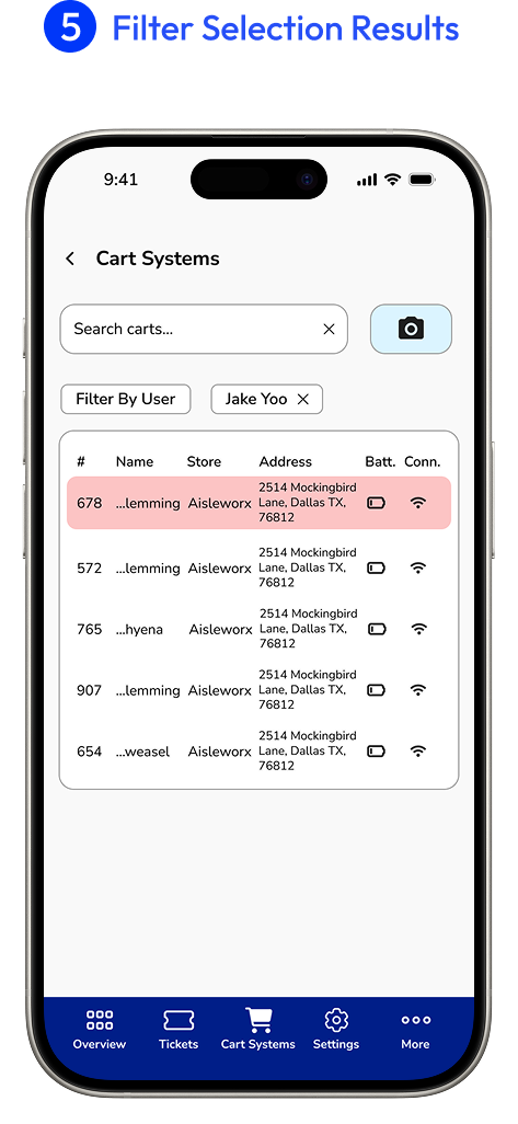
To improve the speed of finding items, information was reorganized by priority and number of clicks was reduced to improve access to certain pieces of information or actions.
Single Click Codes: identification numbers related to the product were kept at the top of the page and had the ability to be copy and pasted for other uses with a click.
Information was condensed into tabs to reduce the amount of scrolling needed to view items on the page.
Prioritizing and Condensing: several groups of information were condensed into a container with tabs so that users would be able to quickly switch between sections.
The original site was functional but lacked visual hierarchy and organization, so I wanted the new design to be more informative and scannable.
Clearer Layout: different pieces of information were contained in different cards to make it easier to visually differentiate between sections.
I progressed through several different design layouts before landing on the right combination.
Even though information was easier to read in these containers, there still wasn't enough information shown about the system, particularly in the actions section.
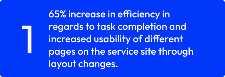
Users were tasked with locating a piece of information on the screens while being timed. Results showed that those who used the redesigned screens were able to locate things at a 65% rate faster than those who had been using the original screens.
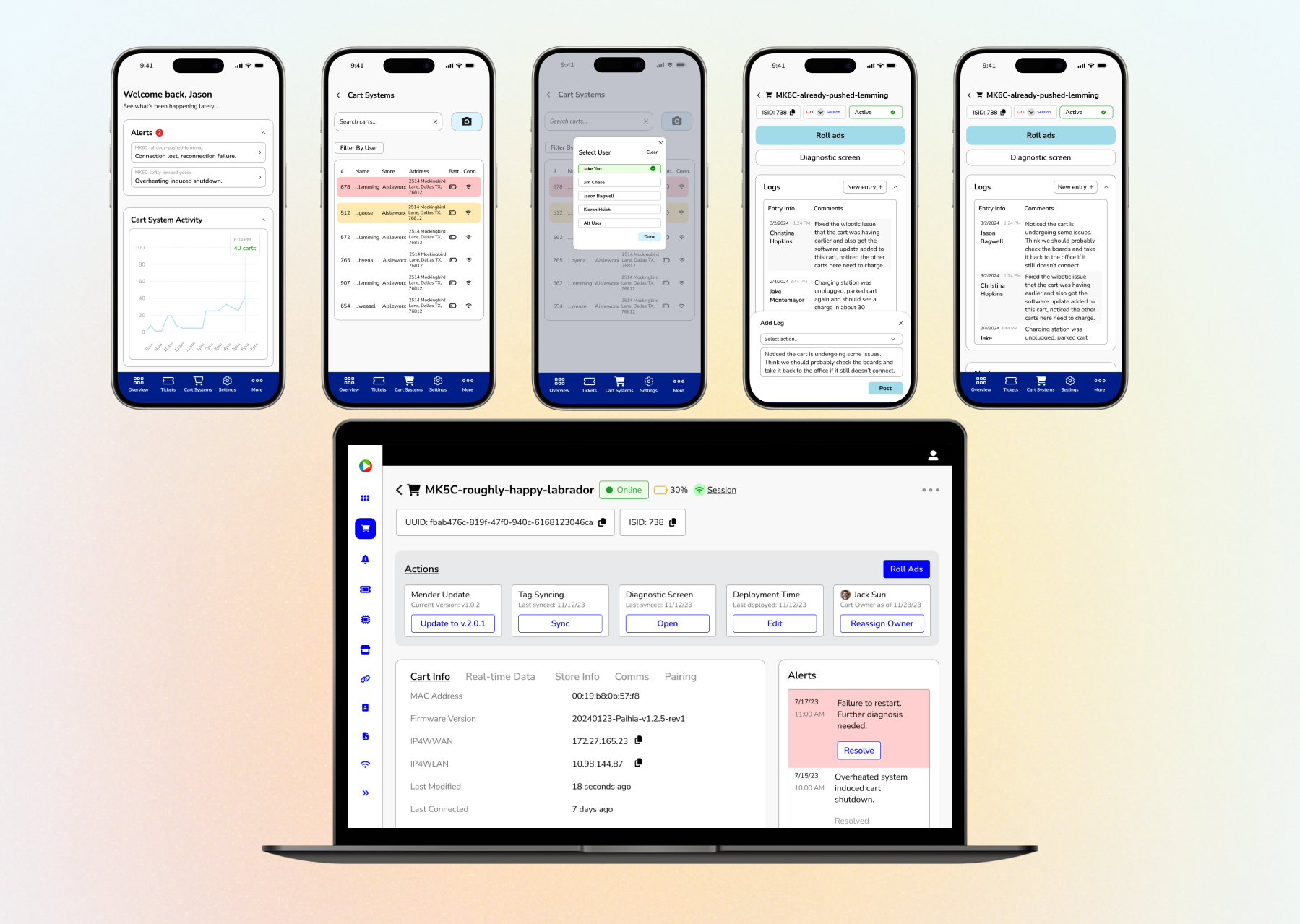
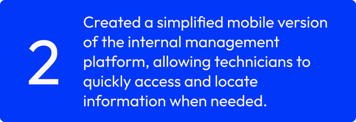
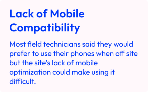
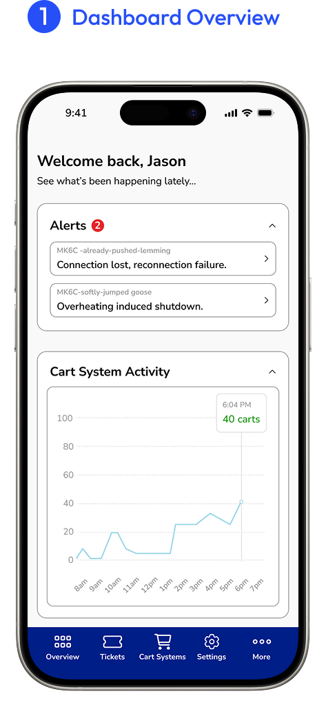
During user interviews, we found that 85% of the time users would be trying to access the service site from their phone while out in the field if operations were simple enough to do so. However, the website was not optimized for mobile use.
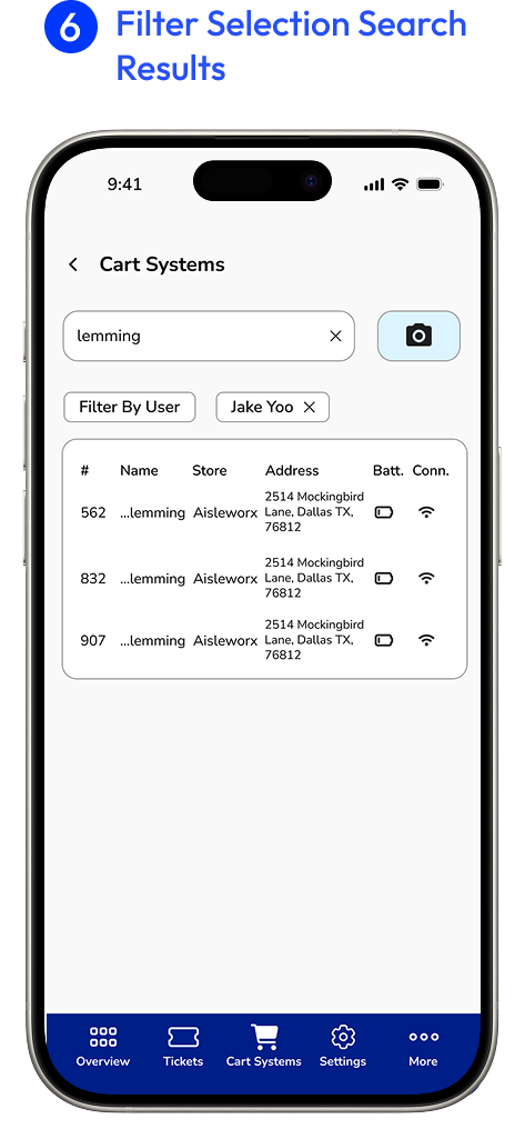
Much of the information on the service site is displayed on large tables that contain a lot of content, but mobile devices don’t necessarily have the size to support that kind of view.
Certain functions on the site may perform better on the laptop, so there is a need to determine which site functions should be part of the mobile design.
I reduced content-rich tables to only essential pieces of information to help with readability for users. Full versions of the tables would need to be viewed through the desktop version of our site.
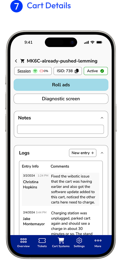
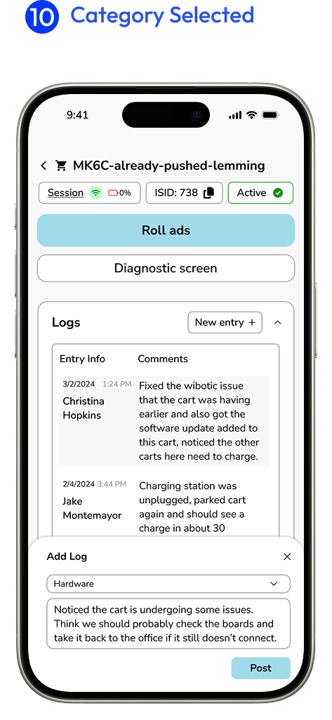
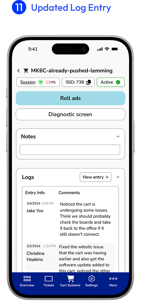
Logs and notes were two features that allowed users to record various important things about the cart they were maintaining. Allowing users to quickly enter notes and categorize them with a tap helped to streamline the process.
The main functions a technician would be able to take on the mobile app would be to diagnose any further issues of a cart and resume the rolling of ads on their digital screens to set the cart back into its standard mode. Using the desktop site would show the full range of actions a technician could take for a cart.


It was important to consider the technical limitations of the platform and the bandwidth of the development team while still delivering a functional experience within the timeframe I had been given for the site updates. I learned that constant communication and sharing of designs is so important and helps guide us towards the best outcome for users and stakeholders.
During this design process, I learned that there will be times where further research is needed to clarify design decisions and times where design iterations will be reworked due to potential constraints or stakeholder requests. The process towards a final product can be messy but rewarding once all the pieces fall into place.
